library(ggplot2)
ggplot(iris, mapping = aes(Petal.Length, Petal.Width)) + geom_point()
Effective data visualization is an essential requirement for understanding the data. Done rightly, graphs are indeed worth thousands of words. As we have seen before, for plotting vectors, we can use the plot and lines functions. However, these functions are not designed to process (large) dataframes. The tidyverse package has ggplot2 library that offers a robust way of performing visual analysis of the data. This library, in fact, is now a standard way of plotting graphs in R. It can be installed using install.packages("ggplot2").
ggplot2 libraryIn its simplest form, the ggplot function takes two arguments – a dataset (generally a dataframe) and an aes object. The aes function specifies the components of the dataframe that should constitute the aesthetics of the plot (more on this below). The ggplot function alone won’t generate the graph that we expect. That’s because the ggplot function only declares what is the data source and how to use different components (columns) within the plot and it does not specify the representation of the data. For this we need to add geom (geometric object) to the plot. A geom object would specify the required representation (e.g., points or line or bar etc.) of the data within the graph. For instance, to make a scatter plot, geom_point should be added to the ggplot function. So, to make a plot we need at least three components – data, aesthetics, and geometric object.
Below, using the iris data, we plot a graph between petal length and petal width as a scatter plot. The first argument in the ggplot function is the dataframe that contains the data to be plotted. We can also specify this dataframe using the data keyword argument. Next, we need to specify the mapping of the aesthetics using the aes function. The aes function is used to map the columns of the dataframe to the x- and y-axes of the graph. In code below, the Petal.Length column values will be mapped along the x-axis and the Petal.Width along the y-axis. This is the minimum set of arguments required for the ggplot function to generate a graph. Now we need specify a geometric representation of the data. This is achieved using the geom_point function that adds a geometric layer to represent the data as points.
library(ggplot2)
ggplot(iris, mapping = aes(Petal.Length, Petal.Width)) + geom_point()
Let’s say we want to color the points in the graph based on the species of the Iris plant. This information is there in the iris dataset. Since here we are using some additional information within the dataframe so we need to modify the aes to get the required plot. That is, we need to “map” the color to the Species column. Notice how the plot has changed with different colors for different species and a legend has been added to the plot.
ggplot(iris, aes(Petal.Length, Petal.Width, color = Species)) + geom_point()
It is generally a good idea to have the aes specified within the ggplot function so that the aesthetics apply to all the geom layers. However, if required, we have an option to include an aes mapping within a geom layers as well. A mapping within geom will override the aesthetics given in the ggplot function. This provides additional flexibility in terms of rendering the final graph.
All geom functions have the mapping keyword argument that can be used to specify the aesthetics. So, an alternate way of plotting the graph is to use mapping argument of the geom function to specify the aesthetics instead of specifying aes in the ggplot function. This approach helps us to display multiple datasets within one graph. The code below creates two plots in one graph and it also shows an example of manually adding a legend and modifying the x- and y- ticks.
   Number Square Cube
1       1      1    1
2       2      4    8
3       3      9   27
4       4     16   64
5       5     25  125
6       6     36  216
7       7     49  343
8       8     64  512
9       9     81  729
10 10 100 1000ggplot(data = df1) +
geom_point(mapping = aes(Number, Square, color="red"), pch=15) +
geom_line(mapping = aes(Number, Square,color="red")) +
geom_point(mapping = aes(Number, Cube, color="brown"), pch=17) +
geom_line(mapping = aes(Number, Cube, color="brown")) +
labs(y="Value") +
scale_color_identity(guide = "legend", name="Value",
labels = c("Cube", "Square")) +
scale_x_continuous(breaks = c(1:10)) +
scale_y_continuous(breaks = seq(0,1000,200))
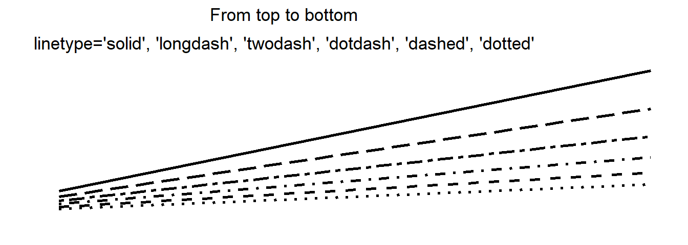
Now let’s explore the concept of aesthetics in more detail. In a plot, so far we have used aes to map the x- and y-axes to the columns of the dataframe, and also used it to color the points based on the species of the iris plant. Likewise, we can map different features of a plot like size, shape, linetype, and color/fill to different values. The corresponding keyword arguments of the aes function can be modified to get the desired rendering of the plot. These additional aesthetics need not be always mapped to some data. We can directly customize some of the aesthetics e.g. below are the options for the marker shapes and line styles. The color can be specified as string indicating color name or as hex value.
So, the choice of aesthetics will depend upon what data do we have and how we would like to plot it. For instance, to color the data points based on some categorical variable in the data, the color can be set to that categorical column. The same concept applies to changing marker size by some data (column) instead of having same size for all the data points. Below is a list of all the aesthetics that can be adjusted using the corresponding keywords for the aes function. Note that not all geom supports all the aesthetics, e.g., linetype can be used with geom_line but not with geom_point.
adj, alpha, angle, bg, cex, col, color, colour, fg, fill, group
hjust, label, linetype, lower, lty, lwd, max, middle, min, pch
radius, sample, shape, size, srt, upper, vjust, weight, width, x
xend, xmax, xmin, xintercept, y, yend, ymax, ymin, yintercept, z
Below are the different marker shapes corresponding to the numeric value for the shape keyword argument of the aes function.

Size of a marker or width of a line can be adjusted using the size or the linewidth (or lwd) arguments respectively. Both of these keyword arguments take a number
The next important component or the layer in a graph is geometric object i.e. the required representation of the data. The geom function is used to declare the representation of the data e.g. whether we would like to have a scatter plot (geom_point), line plot (geom_line), or bar plot (geom_col). Since each of these functions adds a layer to the plot, it is straightforward to have multiple representations in one plot. The aesthetics for each of these geom layers can be individually adjusted by mapping the aes function. The version 3.4.3 of ggplot contains 53 options for geoms as given below. Note that with newer versions of ggplot, more geoms may be added and the list below may not be exhaustive. For the latest list of geoms, you can refer to the official documentation of ggplot2 package.
geom_abline, geom_area, geom_bar, geom_bin_2d, geom_bin2d, geom_blank, geom_boxplot
geom_col, geom_contour, geom_contour_filled, geom_count, geom_crossbar, geom_curve
geom_density, geom_density_2d, geom_density_2d_filled, geom_density2d, geom_density2d_filled
geom_dotplot, geom_errorbar, geom_errorbarh, geom_freqpoly, geom_function, geom_hex, geom_histogram
geom_hline, geom_jitter, geom_label, geom_line, geom_linerange, geom_map, geom_path
geom_point, geom_pointrange, geom_polygon, geom_qq, geom_qq_line, geom_quantile, geom_raster
geom_rect, geom_ribbon, geom_rug, geom_segment, geom_sf, geom_sf_label, geom_sf_text
geom_smooth, geom_spoke, geom_step, geom_text, geom_tile, geom_violin, geom_vlineTo enhance the representation of the graphs, we can use the theme function. E.g. we can change the background color of the graph and also alter the grid lines as shown below. Note how we can create a graph object and then change the theme as required. The different aspects of the legend can also be modified with the theme function. For example, in the code below, the legend.position keyword argument is used to change the legend position. The labs function is used to set/modify different graph labeling such as x and y axes label, title, subtitle, etc.
p <- ggplot(data = iris) +
  geom_point(mapping = aes(Petal.Length, Petal.Width, shape = Species, color = Species))
p + theme(panel.background = element_rect(fill = "azure")) +
  theme(panel.grid.major = element_line(colour = "grey")) +
  theme(legend.position = "bottom") +
  labs(x = "Petal Length", y = "Petal Width")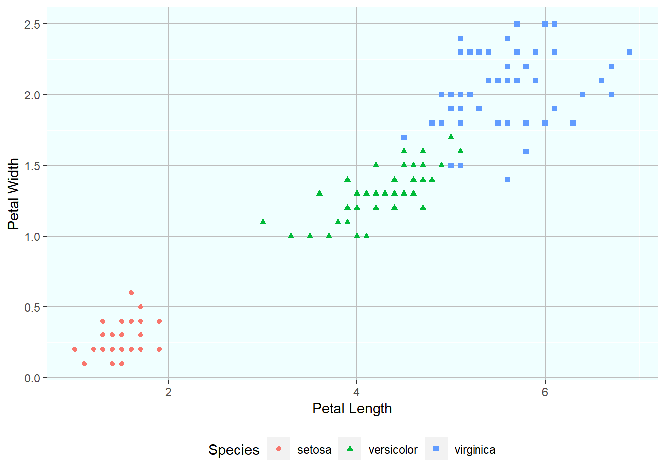
Apart from manually altering the theme of a plot, we can also use the in-built themes to “automatically” set various graph options for visual appeal. In addition, there are packages like ggthemes that provide an additional set of well-known themes. Below are two examples of the themes available in this library – theme_clean() and theme_wsj().
library(ggthemes)Warning: package 'ggthemes' was built under R version 4.4.3p <- ggplot(data = iris) +
geom_point(mapping = aes(Petal.Length, Petal.Width, shape = Species, color = Species)) p + theme_clean()
p + theme_wsj()
Faceting allows us to make subplots with a single plot. This is useful when we want to segregate the plot based on some categorical variable. The facet_wrap function takes a formula as an argument, which specifies the variable to be used for faceting. Note that facet_wrap is added as an additional layer to the plot.
iris |>
  ggplot(aes(Petal.Length, Petal.Width, shape = Species, color = Species)) +
  geom_point() +
  facet_wrap(~ Species) +
  theme(legend.position = "none") +
  labs(title = "Facet Wrap by Species")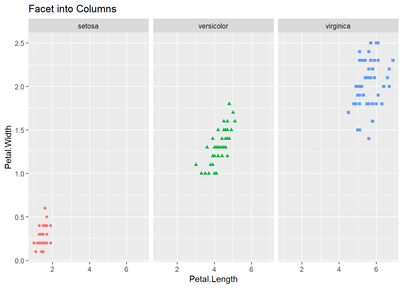
In case we want to create subplots based on two different categorical variables then we can use facet_grid function. This function again takes a formula as an argument, but with two values — left hand side specifies the variable for rows and right hand side for columns. The facet_grid function can be used with one variable as well, with a dot (.) on the other side of the formula. This will create a row-wise or column-wise facets for that single variable.
iris |>
  ggplot() +
    geom_point(mapping = aes(Petal.Length, Petal.Width, shape = Species, color = Species)) +
    facet_grid(. ~ Species) +
    theme(legend.position = "none") +
    labs(title = "Facet into Columns")
iris |>
  ggplot() +
    geom_point(mapping = aes(Petal.Length, Petal.Width, shape = Species, color = Species)) +
    facet_grid(Species ~ .) +
    theme(legend.position = "none") +
    labs(title = "Facet into rows")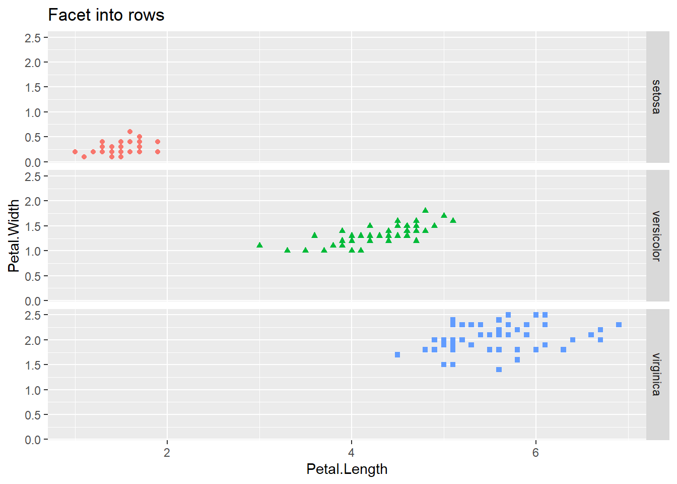
esquisse packageThe esquisse package provides a graphical interface to generate ggplot code for plotting some data. This is a great utility for all those who are new to ggplot syntax since it allows user to generate the code for the plot in an interactive manner. This package can be installed by running install.packages("esquisse"). Once installed, launch the GUI by executing esquisse::esquisser(). In the window that pops up, select the data frame (should be already present) that you would like to plot. Next, drag and drop columns for different aesthetics for ggplot such as columns for the x and y axes, column for coloring the plot. Select the desired representation (geom) and adjust other parameters as per the options in the bottom panel. Finally, click on the code button on the bottom right and you’ll get the ggplot code for the graph which can be directly inserted into the R script.
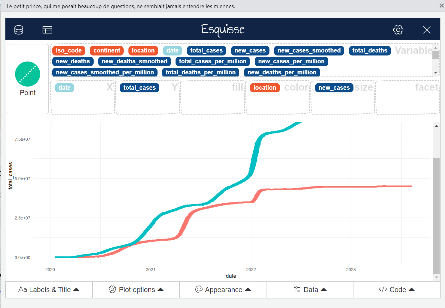
The code for the graph shown in the screenshot above, as generated by esquisser, is given below.
# The dataframe has data for
# India and United States only.
ggplot(df_covid_IUS) +
  aes(
    x = date,
    y = total_cases,
    colour = location,
    size = new_cases
  ) +
  geom_point(shape = "circle") +
  scale_color_hue(direction = 1) +
theme_minimal()Venn diagrams are a great way to visualize the overlap across multiple sets. In the default ggplot2 package there are no functions to create Venn diagrams. However, we can use the ggVennDiagram package to create Venn diagrams in R. This package can be installed using the command install.package("ggVennDiagram"). This package is built on top of the ggplot2 package so it natively supports the ggplot syntax.
Let’s load this library.
library(ggVennDiagram)Warning: package 'ggVennDiagram' was built under R version 4.4.3Now we’ll create four vectors and use them to create a Venn diagram. The ggVennDiagram function takes a list of vectors as input. The category.names argument can be used to specify the names of the sets in the diagram. The scale_fill_gradient function can be used to set the color gradient for the diagram.
v1 <- c(1:5)
v2 <- c(5:8)
v3 <- as.integer(c(5,7:10))
v4 <- c(4:6,8:10)
print(v1)
[1] 1 2 3 4 5print(v2)[1] 5 6 7 8print(v3)[1] 5 7 8 9 10print(v4)[1] 4 5 6 8 9 10ggVennDiagram(list(v1,v2,v3,v4), label = 'count') +
scale_fill_gradient(low="white", high="blue")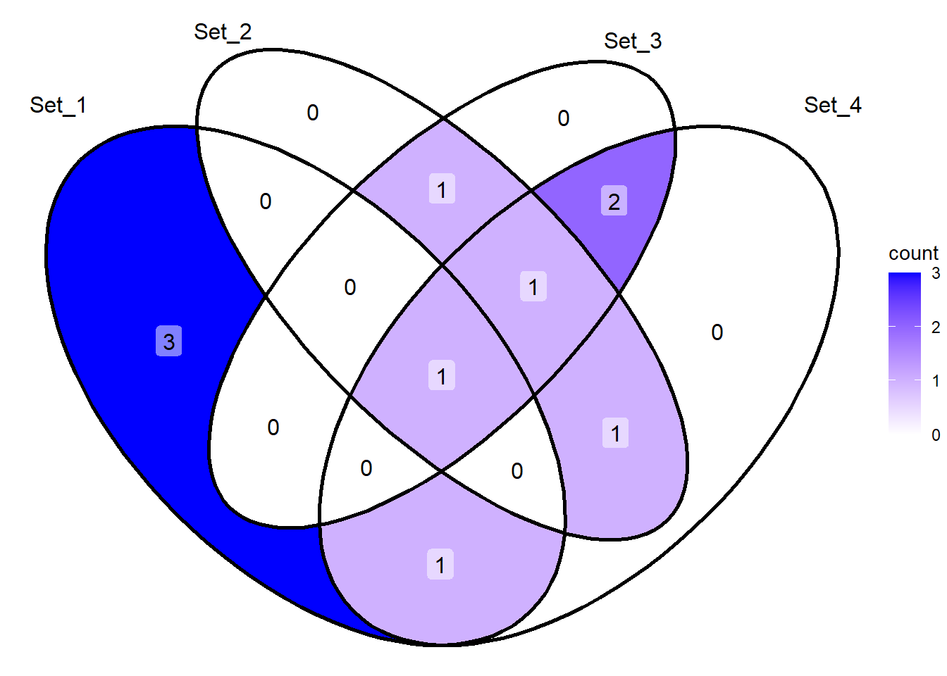
ggVennDiagram(list(v1,v2,v3), category.names = c("A","B","C")) 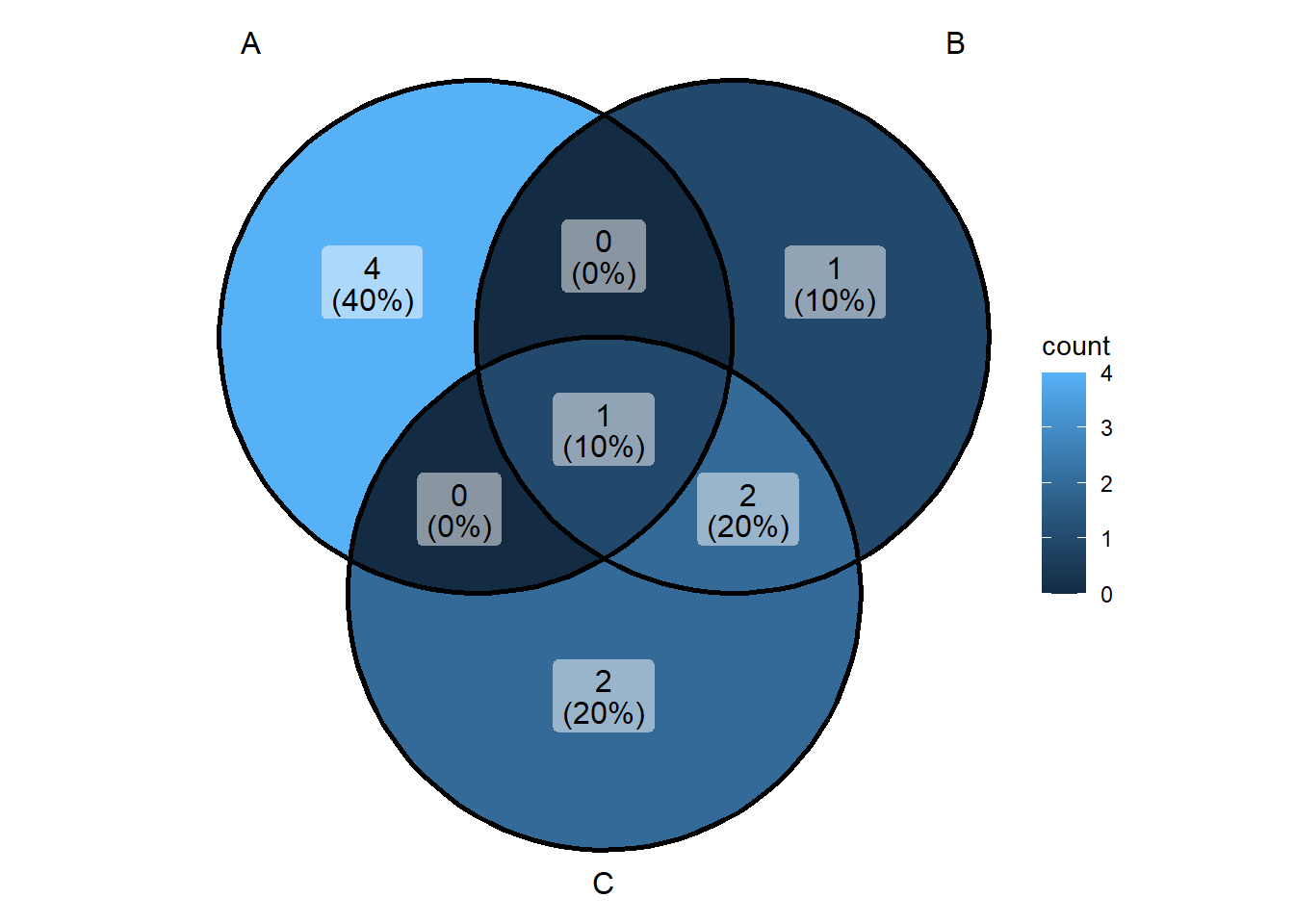
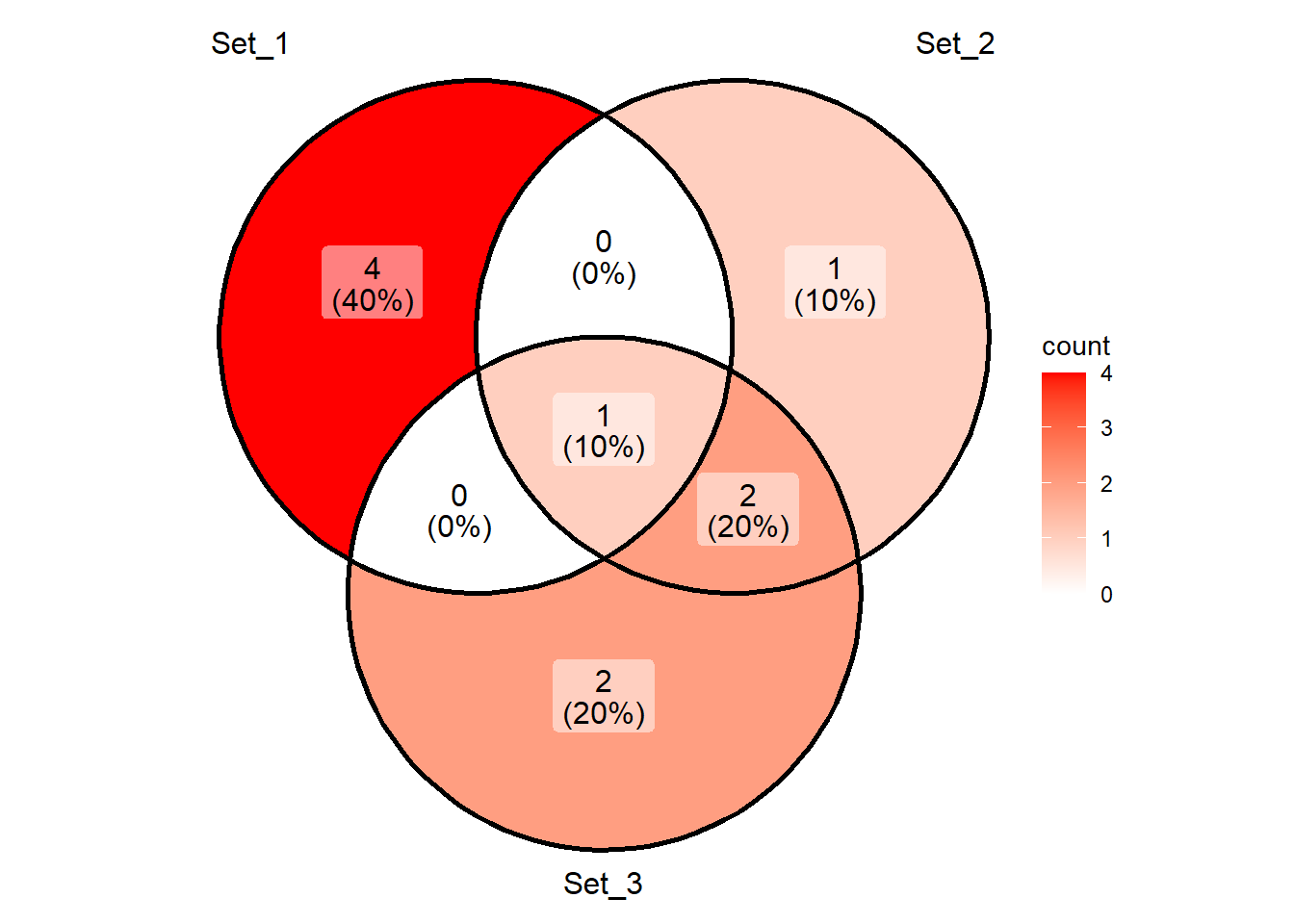
We can also use character vectors to create Venn diagrams as shown below.
c1 <- letters[1:5]
c2 <- letters[5:8]
c3 <- c(letters[5],letters[7:10])
print(c1)
[1] "a" "b" "c" "d" "e"print(c2)[1] "e" "f" "g" "h"print(c3)[1] "e" "g" "h" "i" "j"ggVennDiagram(list(c1,c2,c3)) +
scale_fill_gradient(low="white", high="red")